
GoNomad web app
GoNomad web app
Introduction:
Introduction:
Introduction:
GoNomad is a product designed to help businesses with incorporation and growth, particularly focusing on simplifying the process of registering and managing businesses internationally in the US, UK and Canada. It offers a user-friendly platform where users can easily incorporate their companies, onboard existing businesses, and manage essential documentation and compliance tasks.
GoNomad is a product designed to help businesses with incorporation and growth, particularly focusing on simplifying the process of registering and managing businesses internationally in the US, UK and Canada. It offers a user-friendly platform where users can easily incorporate their companies, onboard existing businesses, and manage essential documentation and compliance tasks.
As the Lead UI/UX designer for GoNomad, my role was to rethink the user experience, solving existing issues while introducing new features that would streamline the incorporation process. This case study outlines the design process, challenges faced, and the final outcomes.
As the Lead UI/UX designer for GoNomad, my role was to rethink the user experience, solving existing issues while introducing new features that would streamline the incorporation process. This case study outlines the design process, challenges faced, and the final outcomes.
A little background story
A little background story
A little background story
Before GoNomad 2.0 was built, we were using a WordPress web app. It was working but had it own limitations. The onboarding flow was long with alot of unnecessary steps, payments methods were limited, and users had no clear sense of progress. As a result, drop-off rates were high, support tickets kept piling up, and the business registration timelines were constantly delayed all of which frustrated our users and slowed revenue growth.
It was clear that if we wanted to improve user retention, reduce support costs, and ultimately increase successful business incorporation (revenue), we needed a complete redesign.
Before GoNomad 2.0 was built, we were using a WordPress web app. It was working but had it own limitations. The onboarding flow was long with alot of unnecessary steps, payment methods were limited, and users had no clear sense of progress. As a result, drop-off rates were high, support tickets kept piling up, and the business registration timelines were constantly delayed all of which frustrated our users and slowed revenue growth.
It was clear that if we wanted to improve user retention, reduce support costs, and ultimately increase successful business incorporation (revenue), we needed a complete redesign.
Before GoNomad 2.0 was built, we were using a WordPress web app. It was working but had it own limitations. The onboarding flow was long with alot of unnecessary steps, payments methods were limited, and users had no clear sense of progress. As a result, drop-off rates were high, support tickets kept piling up, and the business registration timelines were constantly delayed all of which frustrated our users and slowed revenue growth.
It was clear that if we wanted to improve user retention, reduce support costs, and ultimately increase successful business incorporation (revenue), we needed a complete redesign.
Design Process
Design Process
Design Process
Product discovery & Research
Product discovery & Research
For this redesign, I had just 1 week to run research because we were working with a very tight deadline of 5 weeks. Most of our users are busy business owners, and getting them on a call for user interviews was almost impossible within that time frame. Hence, I had to prioritize other research methods.
Stakeholder Interviews: I had an in-depth meeting with the stakeholders to gain insights into the company’s goals for GoNomad, what a seamless user experience should look like and their expectations for the new platform. This helped in aligning the design goals with business objectives.
Internal Collaboration with the Support and Services Team:
To get to the root of our users’ frustrations, I started by sitting down with the people who knew our users the most, the customer support team. They had detailed knowledge of our users, why they were interested in registering their business abroad and the current challenges our users were experiencing with the current web app.
Support Ticket Analysis : I reviewed past support tickets to identify where users were experiencing the most issues. This gave me actual insights into recurring user pain points.
UX Audit on the Old Web App: To further understand where things were going wrong, I signed up on the old WordPress app and went through the entire flow like a first-time user then I documented all the issues I found.
Competitive Analysis: I also conducted a competitive analysis to identify gaps and opportunities in GoNomad’s current platform compared to competitors such as Clemta, Omegaone, Start Global, Stripe Atlas, Zen Business, Doola, and Osome.
User Research Script
1. What types of users have been visiting the gonomad app?
2. What are the primary reasons customers use the Gonomad website?
Can you mention an instance where the user praised the current gonomad webapp for its ease of use
What challenges or pain points have users expressed while using the app?
Are there any specific aspect that users complained to you that they experienced while using the gonomad website?
From your interactions with customers, can you tell me what are their main goals or reason for using our website.
Have our customers ever complained that the process of getting their business registered too long. e.g too many screen or forms to fill
Have the customers even mentioned that they did not really understand the process or what to do next from the contents shown on the dashboard? if yes where specifically
User pain points
User pain points
After combining findings from the support tickets, UX audits and support team conversations, these were the top user pain points i identified:
After combining findings from the support tickets, UX audits and support team conversations, these were the top user pain points i identified:
📝
📝
Lengthy onboarding flow:
Users complained that the old onboarding flow was too long, required too much detail, and did not save progress when they left, forcing them to start over when they returned.
Lengthy onboarding flow:
Users complained that the old onboarding flow was too long, required too much detail, and did not save progress when they left, forcing them to start over when they returned.
📝
📝
Rigid Onboarding flow
Users couldn’t explore the app or skip onboarding before fully committing to the process.
Rigid Onboarding flow
Users couldn’t explore the app or skip onboarding before fully committing to the process.
📝
📝
Payment Barrier:
Some users failed to complete the onboarding flow, cos they were unable to make payment for their business incorporation business due to the lack of access to stripe and pay stack.
Payment Barrier:
Some users failed to complete the onboarding flow, cos they were unable to make payment for their business incorporation business due to the lack of access to stripe and pay stack.
📝
📝
Poor Feedback
Users were not informed about the status of their incorporation at every stage. No mails or notification were sent out.
Poor Feedback
Users were not informed about the status of their incorporation at every stage. No mails or notification were sent out.
📝
📝
Accessing documents wasn’t straightforward
Users struggled to locate and access their company formation documents directly from the dashboard without assistance.
Accessing documents wasn’t straightforward
Users struggled to locate and access their company formation documents directly from the dashboard without assistance.
User personas
User personas
With the insights I had gotten from the research, I created 2 user personas. These persona represent our typical user, highlighting their goals, pain points, and behaviors.
With the insights I had gotten from the research, I created 2 user personas. These persona represent our typical user, highlighting their goals, pain points, and behaviors.
User persona 1
User persona 1

Name
Name
:
Joseph Yang
Age
Age
:
29 years
29 years
Location
Location
:
Signapore
Occupation
Occupation
:
CEO of a Mid-Sized Tech Company
CEO of a Mid-Sized Tech Company
Years in Business
Years in Business
:
6 Years
6 Years
Tech Savviness
Tech Savviness
:
Advanced
Advanced
Background story
Background story
Joseph runs a mid-sized tech company that is already established in Southeast Asia, but he's looking to expand to Europe and North America.
Incorporating in new countries is a crucial part of this strategy, allowing him to better service international clients. Joseph is highly experienced with international business laws and has worked with incorporation platforms before.
Goals & Motivations
Incorporate quickly and correctly in a recognized country.
Incorporate quickly and correctly in a recognized country.
Raise capital and open international business accounts (e.g. Stripe, Mercury).
Raise capital and open international business accounts (e.g. Stripe, Mercury).
Build credibility with a legal business structure.
Build credibility with a legal business structure.
Have full control over the incorporation process, with clear reporting and updates.
Have full control over the incorporation process, with clear reporting and updates.
Pain Points & Challenges
Finds it problematic that many platforms don’t support multi-business incorporation management.
Finds it problematic that many platforms don’t support multi-business incorporation management.
He is often frustrated by the rigidity of existing platforms, which don’t allow easy corrections once the incorporation process is started.
He is often frustrated by the rigidity of existing platforms, which don’t allow easy corrections once the incorporation process is started.
Wants to see a clear, real-time progress report of his incorporation status without the need to contact customer support.
Wants to see a clear, real-time progress report of his incorporation status without the need to contact customer support.
User persona 2
User persona 2

Name
:
Sarah Jamie
Age
:
29 years
Location
:
Cape town, South Africa
Cape town, South
Africa
Occupation
:
Fashion Entrepreneur
Years in Business
:
3 Years
Tech Savviness
:
Intermediate
Background story
Background story
Sarah has been running her clothing line for about three years, selling mainly within South Africa. She is now ready to expand her business internationally, primarily targeting customers in the US and UK.
Sarah has been running her clothing line for about three years, selling mainly within South Africa. She is now ready to expand her business internationally, primarily targeting customers in the US and UK.
Goals & Motivations
Increase her business credibility by getting it registered internationally
Successfully register her business internationally to access better payment processors and banking systems.
Wants to see a clear, real-time progress report and receive notifications of her business incorporation status without the need to contact customer support.
Pain Points & Challenges
Sarah finds it challenging locating and downloading her business registration documents from the dashboard by herself.
Unable to first explore the webapp before starting her business onboarding process.
Lack of progress tracking left her confused about the status of her business incorporation.
Had to raise support tickets just to inquire about other payment options and updates.
Brainstorming Sessions & Ideation
Brainstorming Sessions & Ideation
Brainstorming Sessions & Ideation
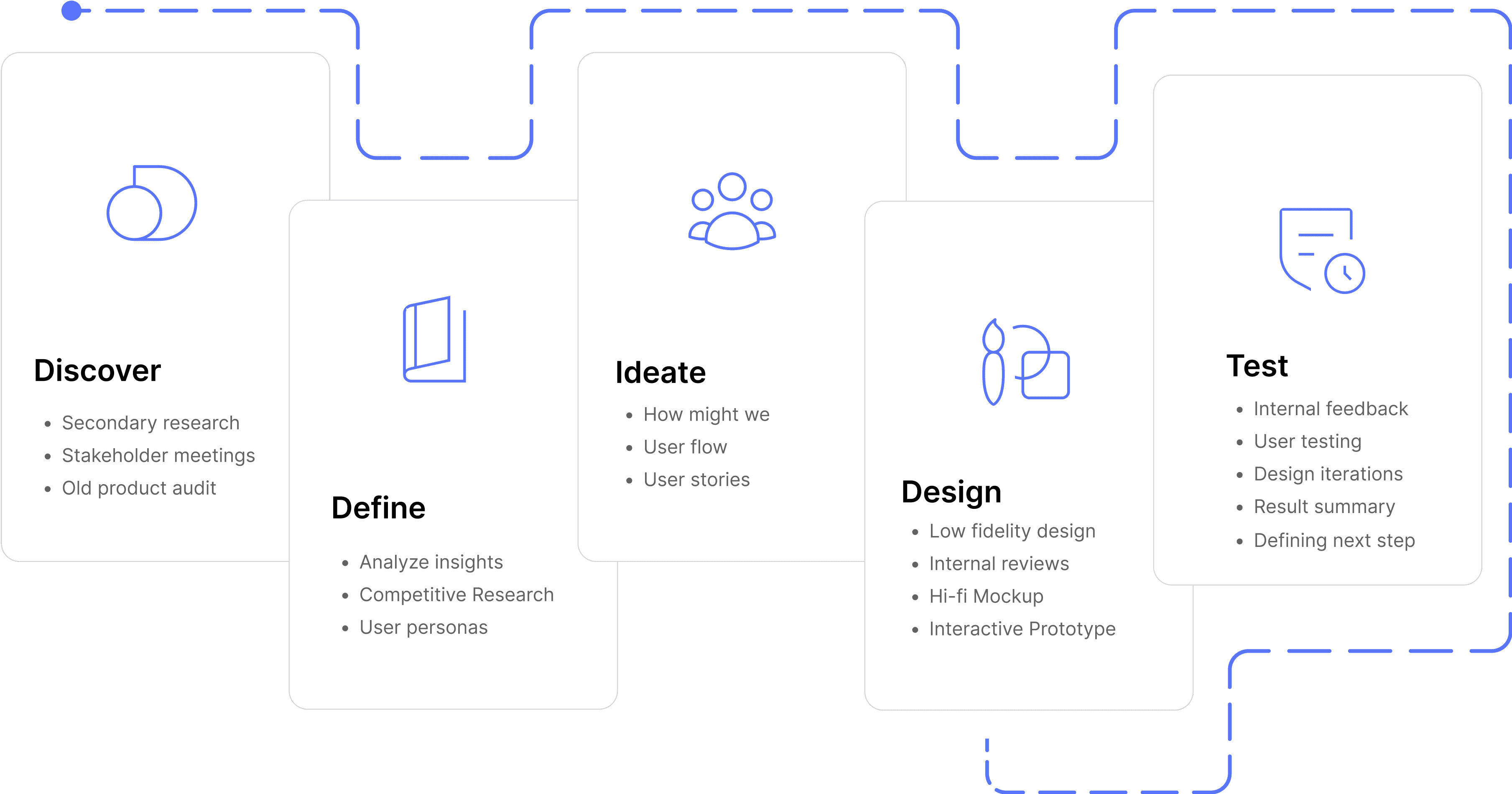
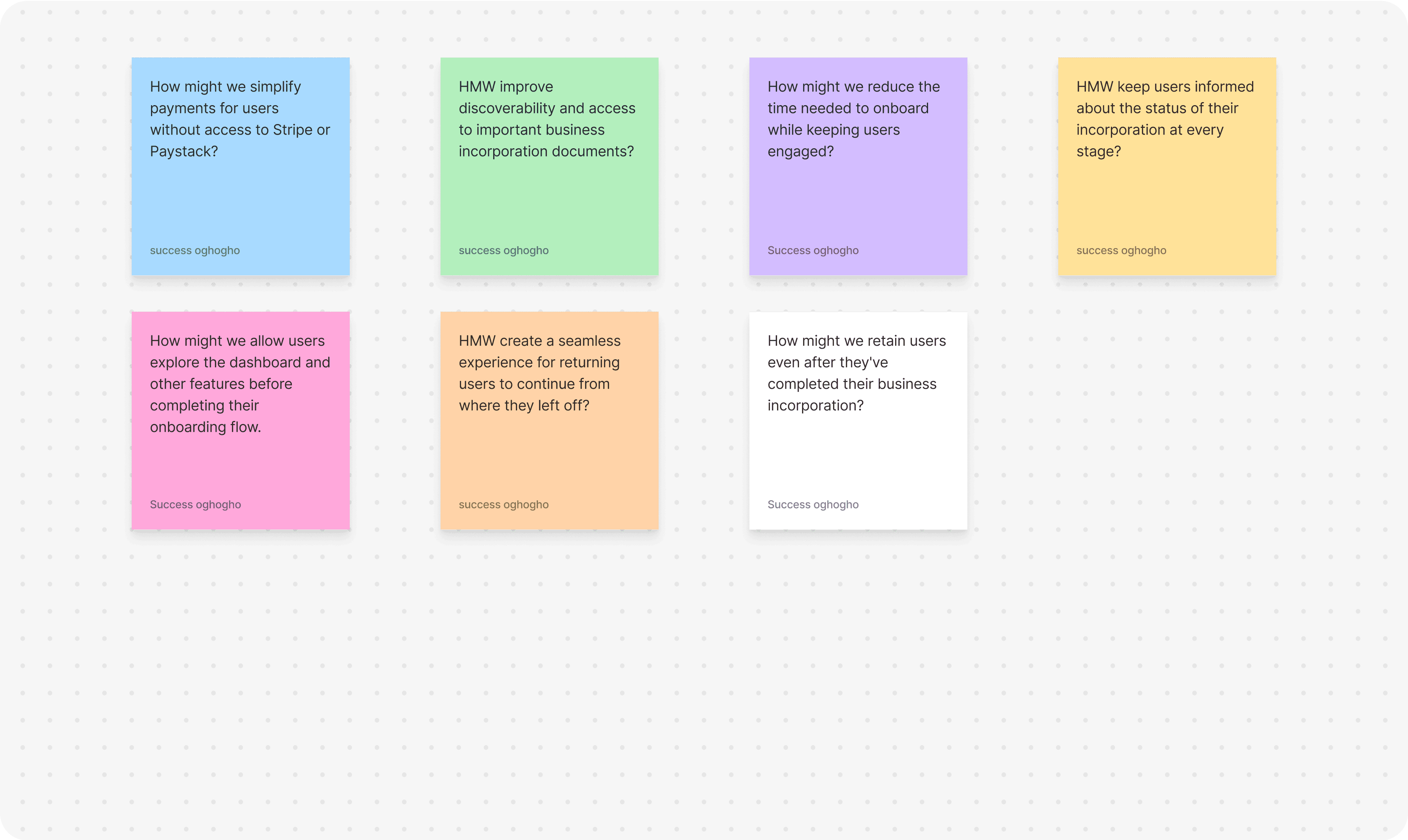
I began the ideation phase by conducting collaborative brainstorming sessions. One of the brainstorming methods i used was the How Might We (HMW) technique. This method helped me generate alot of actionable ideas, prioritize the most impactful solutions, and ensure that every design decision directly addressed real user pain points.
I began the ideation phase by conducting collaborative brainstorming sessions. One of the brainstorming methods i used was the How Might We (HMW) technique. This method helped me generate alot of actionable ideas, prioritize the most impactful solutions, and ensure that every design decision directly addressed real user pain points.
User Flows
User Flows
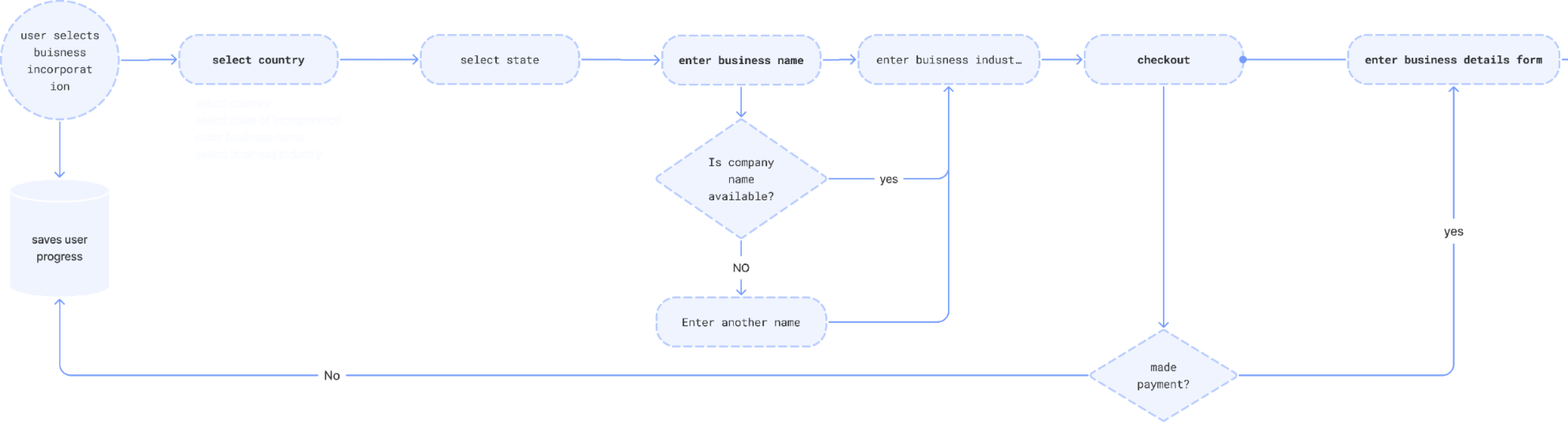
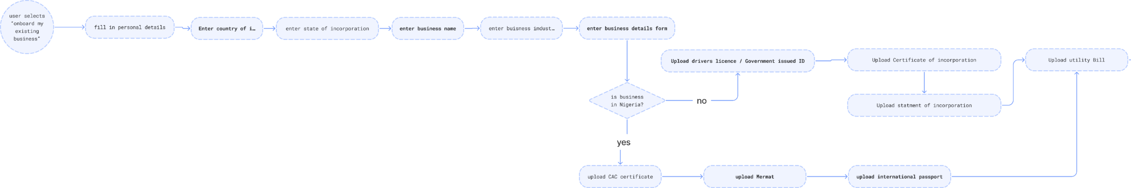
I created user flows to represent the 2 use case our product will cater to.
I created user flows to represent the 2 use case our product will cater to.
User flow 1: “I want to register my business.”
The user starts from scratch, selecting their country of incorporation and progressing through a simple, guided process.
User flow 1: “I want to register my business.”
The user starts from scratch, selecting their country of incorporation and progressing through a simple, guided process.
User flow 2: “I want to skip onboarding and access my dashboard.”
This caters to advanced users who prefer to explore features on their own or return later to complete the process.
User flow 2: “I want to skip onboarding and access my dashboard.”
This caters to advanced users who prefer to explore features on their own or return later to complete the process.
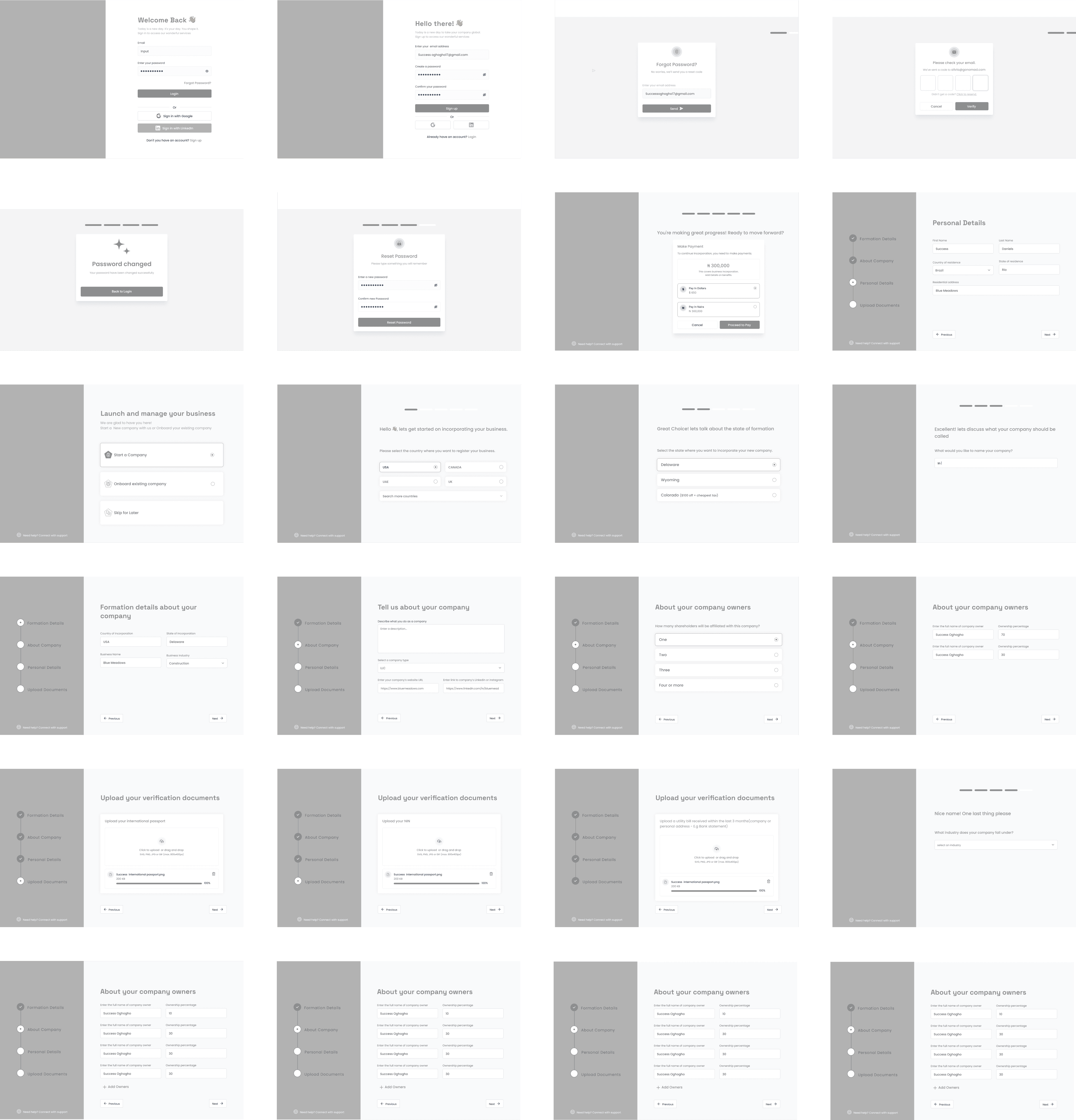
Low fidelity wire frames
Low fidelity wire frames
Low fidelity wire frames
After designing the user flows, I created low-fidelity designs of the key user flows, including:
Registering a New Business
Skipping Onboarding to Explore the Dashboard
These wireframes were reviewed with stakeholders and tested by our internal team, who provided feedback and suggestions. Based on their critiques, i iterated and improved the low fidelity designs, ensuring it met both business objectives and user needs.


Roll-up Stand
Usability testing
Usability testing
Usability testing
After designing the high-fidelity screens. I collaborated with the support team to reach out to some of our current users. With their help, we sent out invitation emails, and seven users responded positively. We then scheduled convenient time slots for the user testing sessions to ensure minimal disruption to their busy schedules.
Study Overview :
Study Overview :
Goal: The goal of the usability testing was to validate whether the new GoLaunch high-fidelity designs were intuitive, easy to navigate, and solved the pain points we identified during the research and UX audit phases. We wanted to ensure that the design flow was smooth before handing it over for development.
Participants: 7 participants which were our actual users.
Date and Location: The usability study took place over the course of one week on Zoom.
Study Facilitators: The study was facilitated by me.
What I Measured (KPIs):
Task Completion Rate: Could they complete the tasks without hints?
Time on Task: How long it took to complete each flow.
Error Rate: Misclicks, confusion, or unnecessary steps taken.
System Usability Score (SUS) – Overall perceived ease of use.
Verbal Feedback – Immediate impressions, likes, and pain points.
User Satisfaction : The KPI was set at an average satisfaction rating of 4.0,
Insights From User Testing
Insights From User Testing
📝
6/7 users preferred the shorter, split onboarding flow and mentioned it felt less overwhelming than filling one long form.
6/7 users preferred the shorter, split onboarding flow and mentioned it felt less overwhelming than filling one long form.
📝
All 7/7 participants easily found their company formation documents using either the nav button or the docs card, which was a huge improvement from before.
All 7/7 participants easily found their company formation documents using either the nav button or the docs card, which was a huge improvement from before.
📝
5/7 users loved that they could pause onboarding and return later without losing their progress.
5/7 users loved that they could pause onboarding and return later without losing their progress.
📝
3/7 participants complained of the inability to preview uploaded documents
3/7 participants complained of the inability to preview uploaded documents
📝
4/7 participants specifically called out manual bank transfer as a great option.
📝
5/7 users mentioned that they would like to see a preview screen of all they have filled in so far before proceeding with payment.
Solving UX Problems
Solving UX Problems
Solving UX Problems
After analyzing the insights from the usability testing, I focused on the high priority pain point areas and began to redesign and improve the UI of the features that needed improvements. The iterations focused on improving clarity, flexibility, and ease of use.
After analyzing the insights from the usability testing, I focused on the high priority pain point areas and began to redesign and improve the UI of the features that needed improvements. The iterations focused on improving clarity, flexibility, and ease of use.
Document Upload and Verification:
Document Upload and Verification:
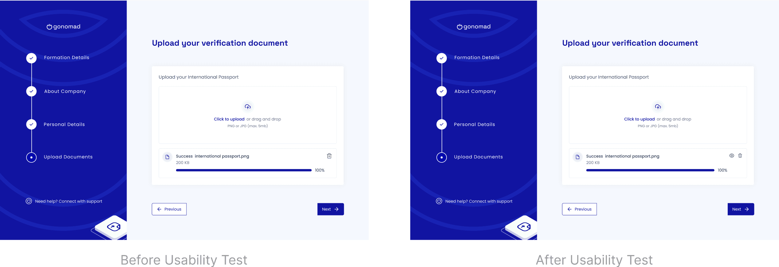
During the onboarding flow, 3 users complained that sometimes they upload the wrong documents without realizing it. I noticed there was no way for users to preview their uploaded files to ensure they had selected the correct documents. To address this, I modified the document upload section by adding a Preview icon next to each uploaded file. This would allow users to review the uploaded document directly within the flow, ensuring they had chosen the correct file. Additionally, I maintained the Delete icon to give users the flexibility to remove and re-upload documents if necessary.
During the onboarding flow, 3 users complained that sometimes they upload the wrong documents without realizing it. I noticed there was no way for users to preview their uploaded files to ensure they had selected the correct documents. To address this, I modified the document upload section by adding a Preview icon next to each uploaded file. This would allow users to review the uploaded document directly within the flow, ensuring they had chosen the correct file. Additionally, I maintained the Delete icon to give users the flexibility to remove and re-upload documents if necessary.
Clarification on Business Onboarding:
Clarification on Business Onboarding:
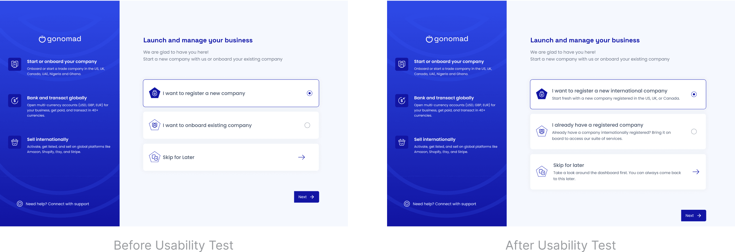
Some users misunderstood the "Onboard Existing Business" option, thinking it applied to locally registered businesses. To address this, I changed the copy and added more descriptive language to clarify the purpose of this option.
Some users misunderstood the "Onboard Existing Business" option, thinking it applied to locally registered businesses. To address this, I changed the copy and added more descriptive language to clarify the purpose of this option.
Business Details Preview Before Payment:
Business Details Preview Before Payment:
5 users mentioned that they would like to see a preview screen of all they have filled in so far before proceeding with payment, in case they need to change anything because after making payments for the business incorporation, previous details filled about the business incorporation can no longer be edited. I wonder how i forgot to include that screen in the flow, well i guess i am human. So i hit up my design board and designed a preview screen as needed
5 users mentioned that they would like to see a preview screen of all they have filled in so far before proceeding with payment, in case they need to change anything because after making payments for the business incorporation, previous details filled about the business incorporation can no longer be edited. I wonder how i forgot to include that screen in the flow, well i guess i am human. So i hit up my design board and designed a preview screen as needed
The Solution
The Solution
The Solution
Problem
Problem
Problem
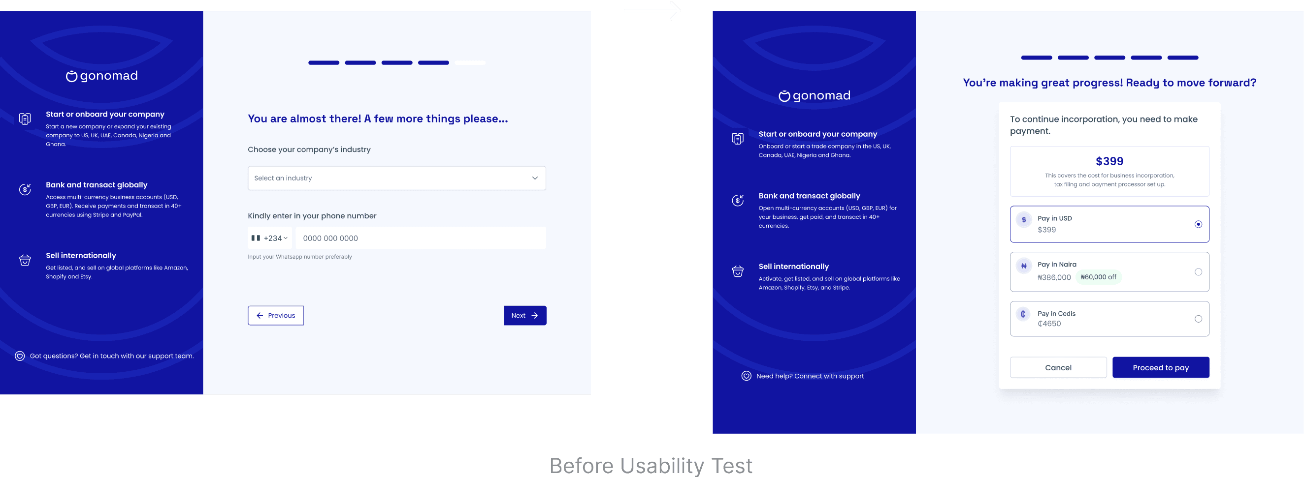
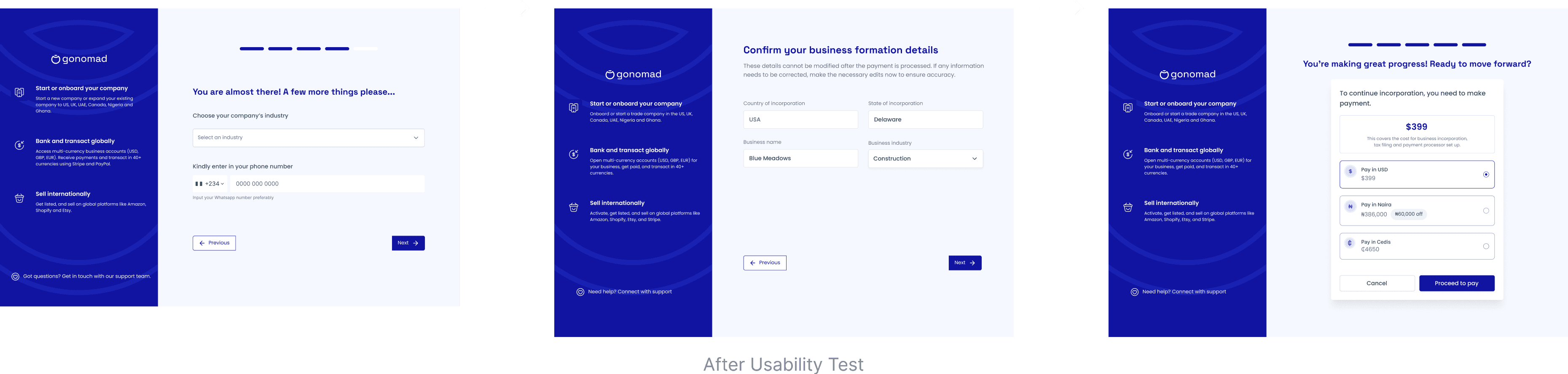
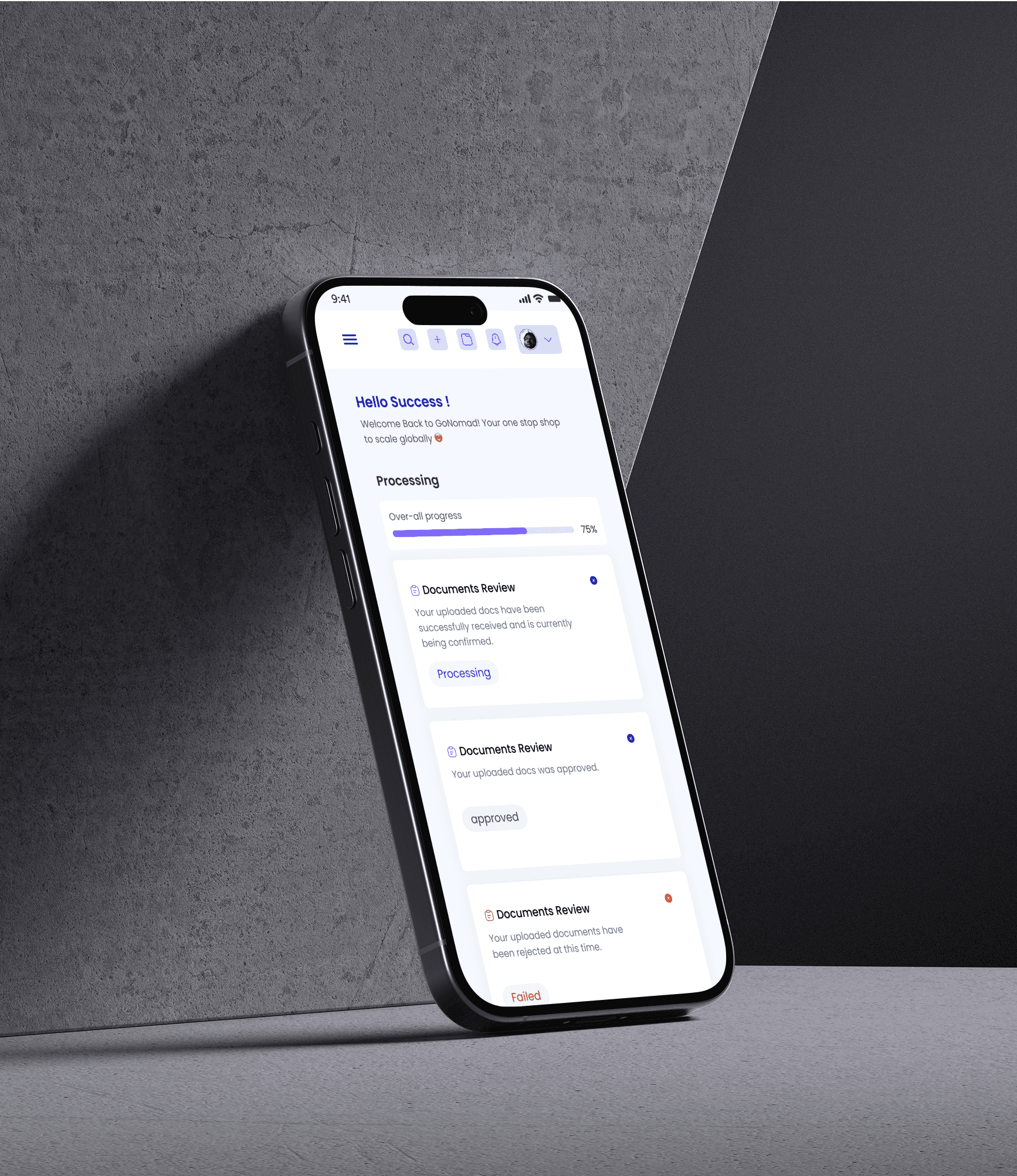
Users complained that the old onboarding flow was too long (15 step form), required too much detail, and did not save progress when they left, forcing them to start over when they returned.
Users complained that the old onboarding flow was too long (15 step form), required too much detail, and did not save progress when they left, forcing them to start over when they returned.
Solution
Solution
Solution
To address this, I redesigned the onboarding flow by splitting it in two parts: users would fill the first 5 important steps before payment and complete the rest after. I also added progress indicators to enable users know how man steps were left, and enabled auto-save so users could return later.
To address this, I redesigned the onboarding flow by splitting it in two parts: users would fill the first 5 important steps before payment and complete the rest after. I also added progress indicators to enable users know how man steps were left, and enabled auto-save so users could return later.
Before Redesign
Before Redesign
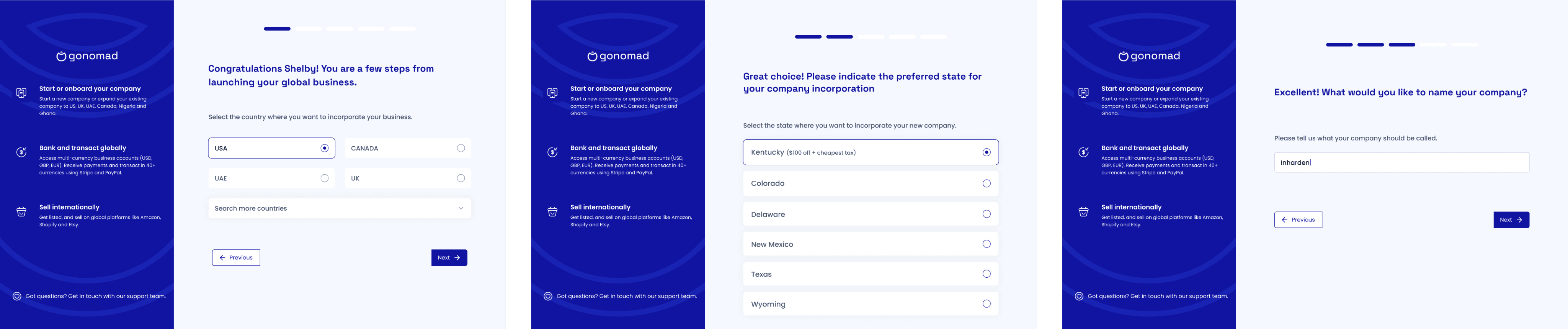
After Redesign
After Redesign
Problem
Problem
Problem
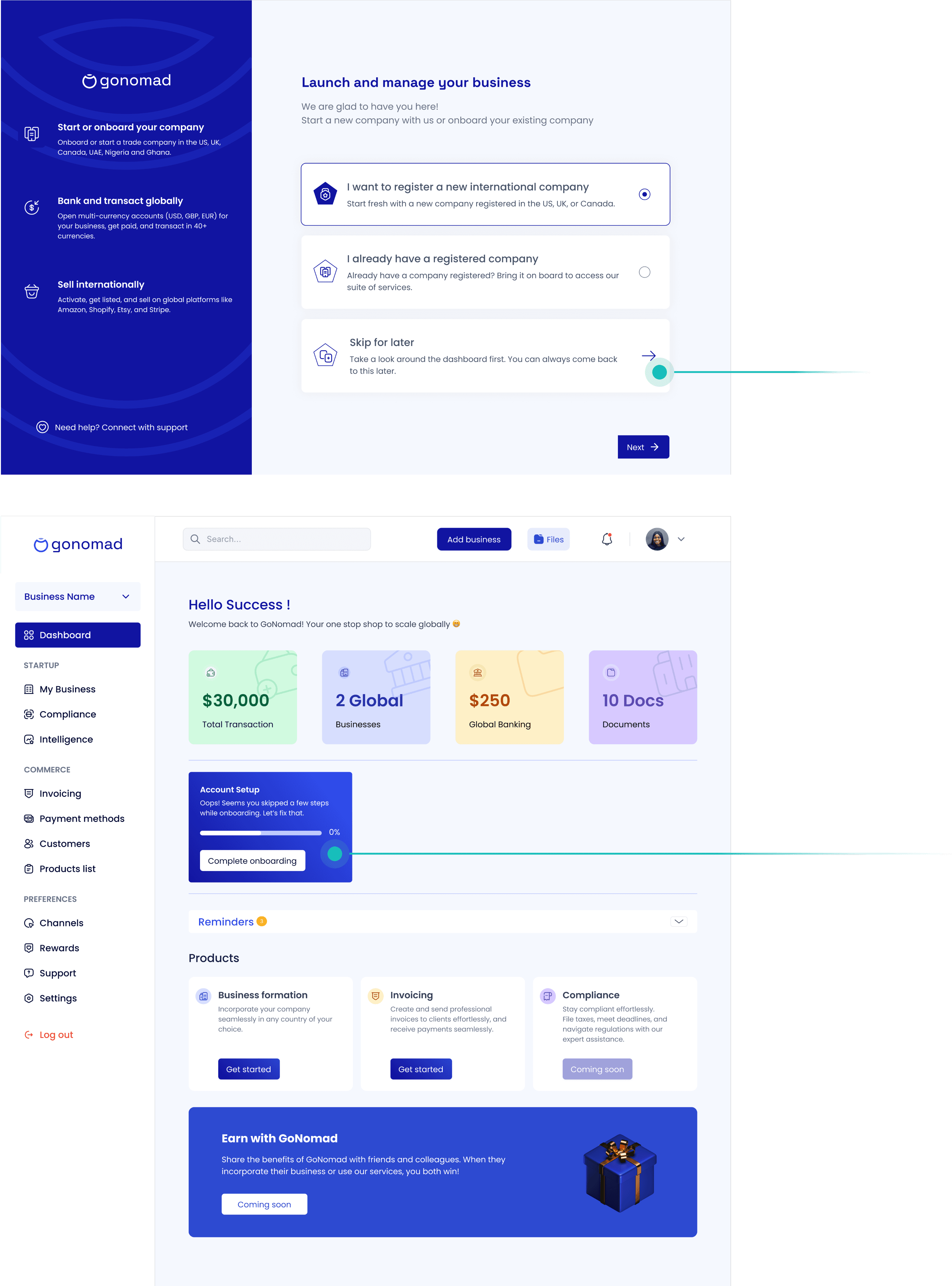
The onboarding flow was too rigid. Users couldn’t skip or explore the app before committing.
The onboarding flow was too rigid. Users couldn’t skip or explore the app before committing.
The onboarding flow was too rigid. Users couldn’t skip or explore the app before committing.
Solution
Solution
Solution
To address this, I added a “Skip for now” option so users could explore the dashboard first and added a modal in the dashboard that prompts user to complete their onboarding. This gave them more control, reduced drop-offs, and improved adoption.
To address this, I added a “Skip for now” option so users could explore the dashboard first and added a modal in the dashboard that prompts user to complete their onboarding. This gave them more control, reduced drop-offs, and improved adoption.
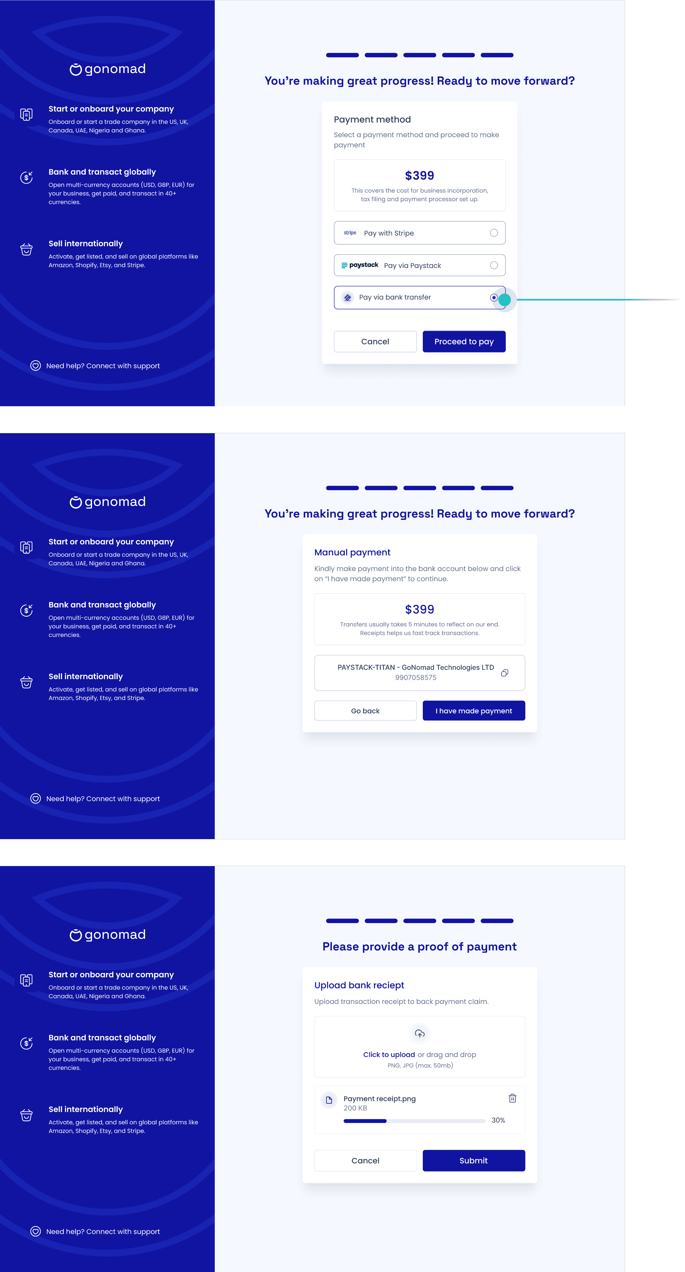
Problem
Problem
Problem
A major pain point for users was paying for the business incorporation fee. Many couldn’t access Stripe or Paystack, preventing them from completing registration and causing the business to lose customers.
Solution
Solution
To fix this, I added a bank transfer option. Here’s how it works: users can make a manual transfer to the company’s account, upload their proof of payment, and still move forward with onboarding while their payment is being confirmed. This way, no one gets stuck just because of limited payment options.
By removing this barrier, I made the platform more inclusive and saw higher conversion rates from users who would have otherwise dropped off at payment.
Problem
Problem
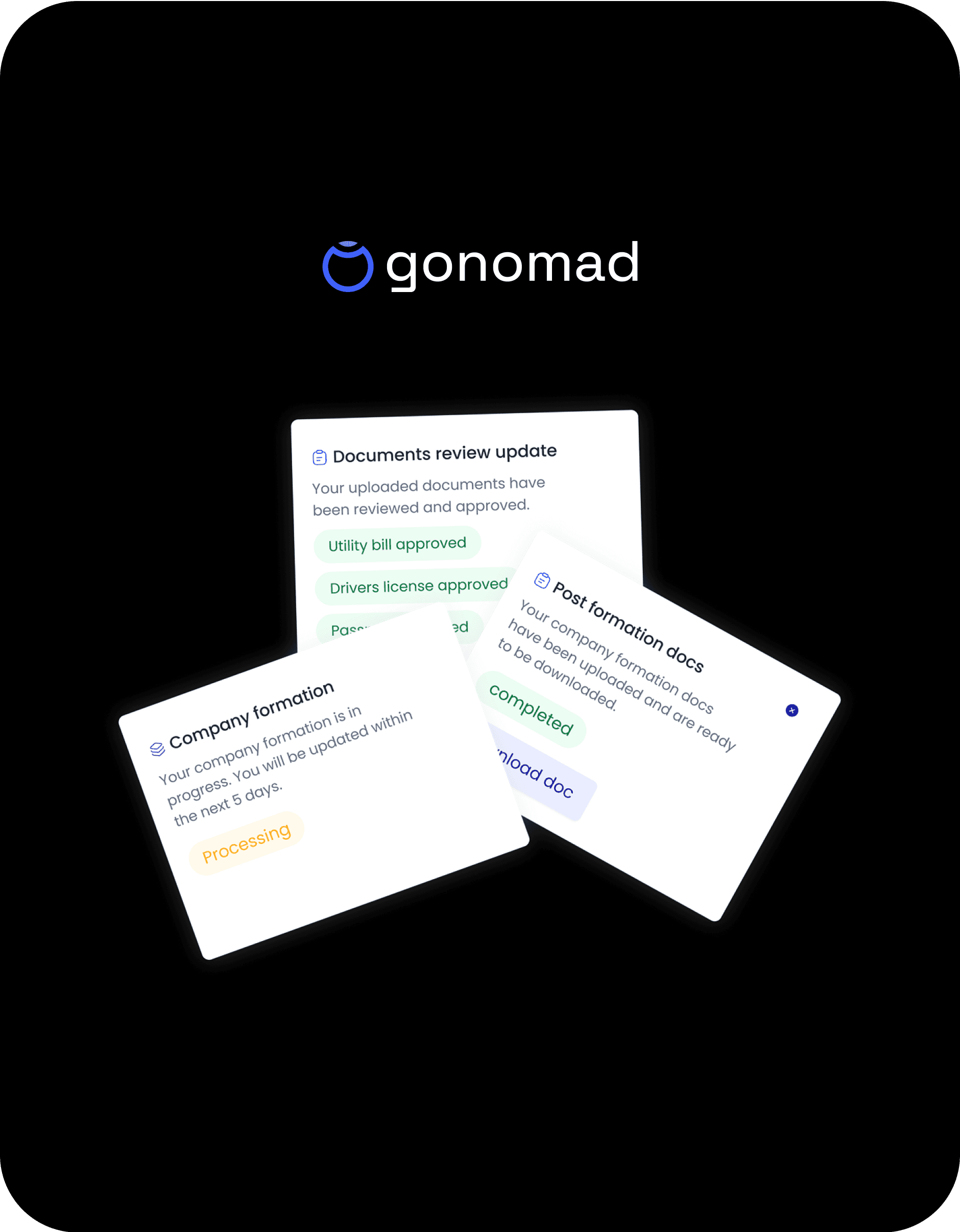
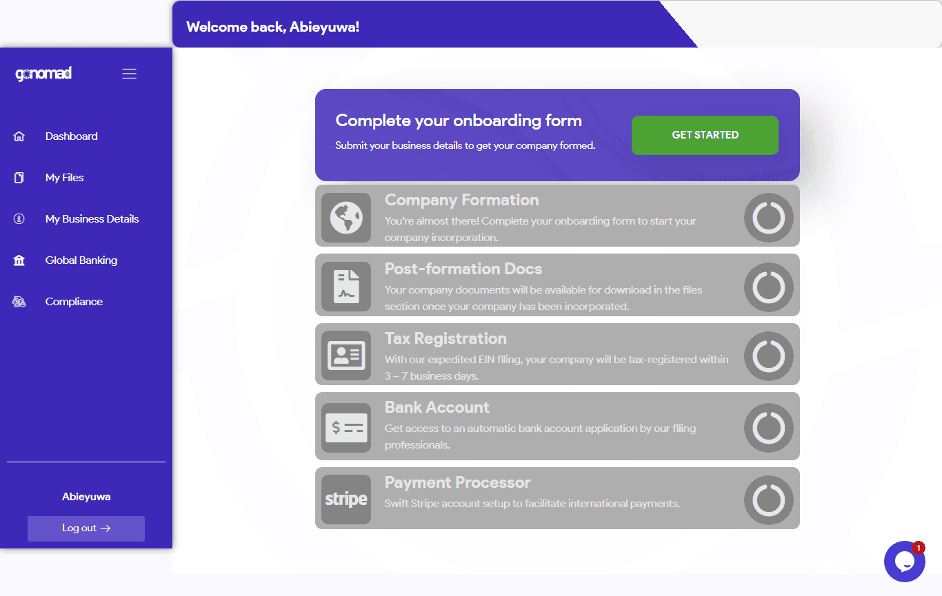
Users had difficulty accessing their company formation documents from the old dashboard and mostimes had to reach out for support.
Users had difficulty accessing their company formation documents from the old dashboard and mostimes had to reach out for support.
Solution
Solution
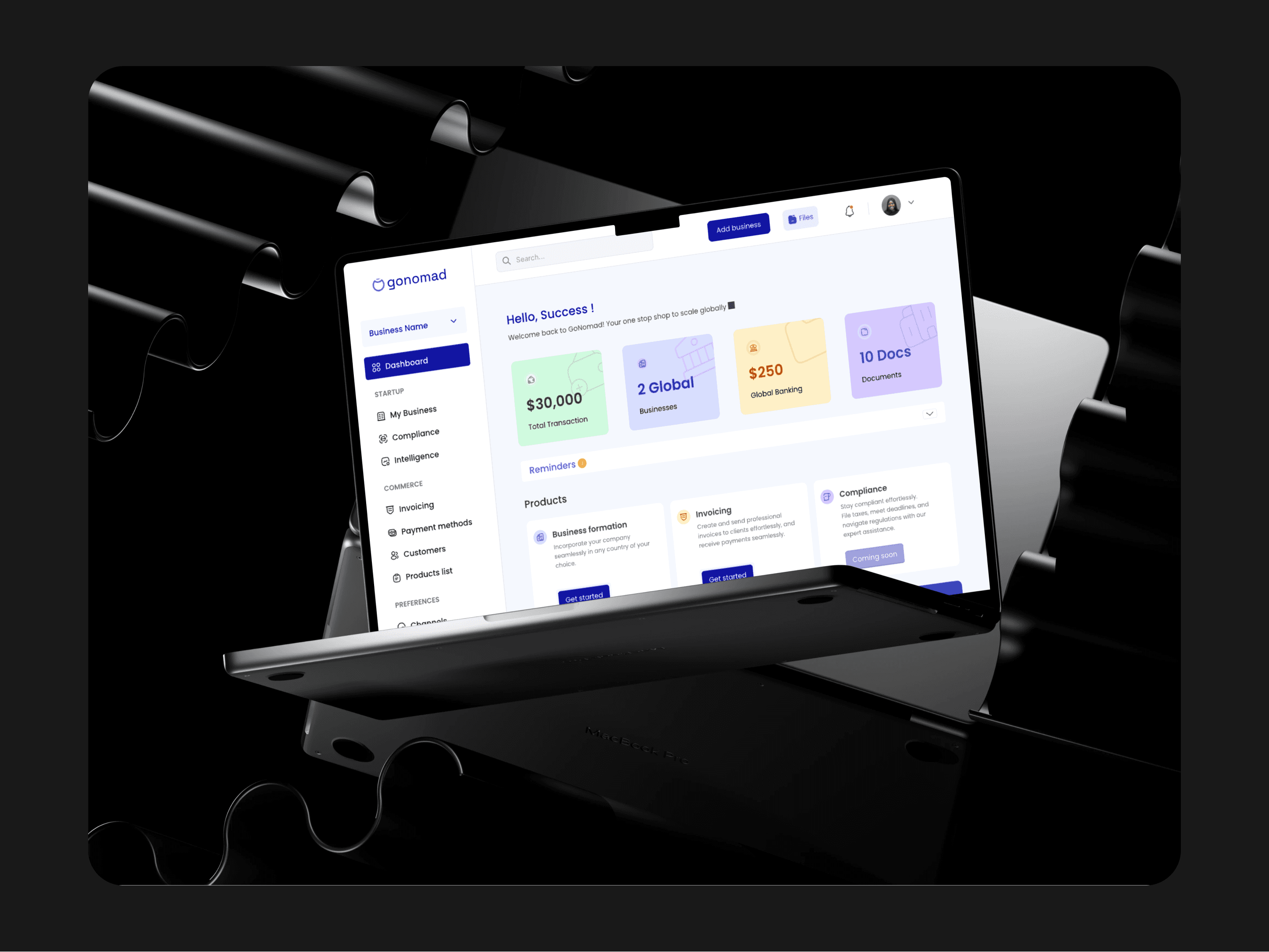
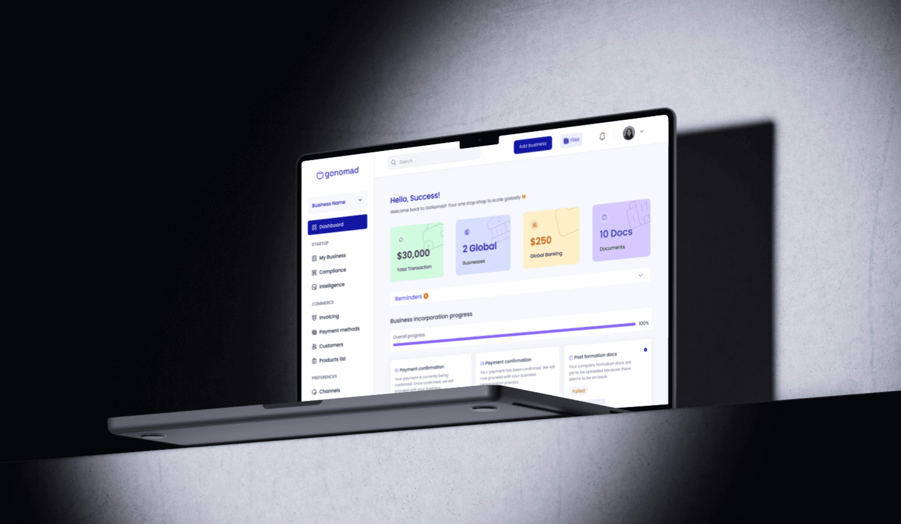
I introduced a dedicated Documents card on the dashboard and added a clear “Docs” button in the top navigation. This made documents easy to discover and access without searching around. As a result, support tickets related to document access dropped significantly.
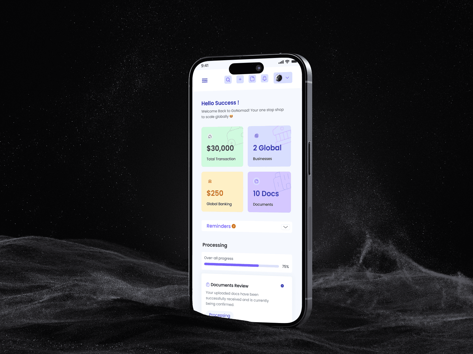
I introduced a dedicated Documents card on the dashboard and added a clear “Docs” button in the top navigation. This made documents easy to discover and access without searching around. As a result, support tickets related to document access dropped significantly.
After Redesign
After Redesign
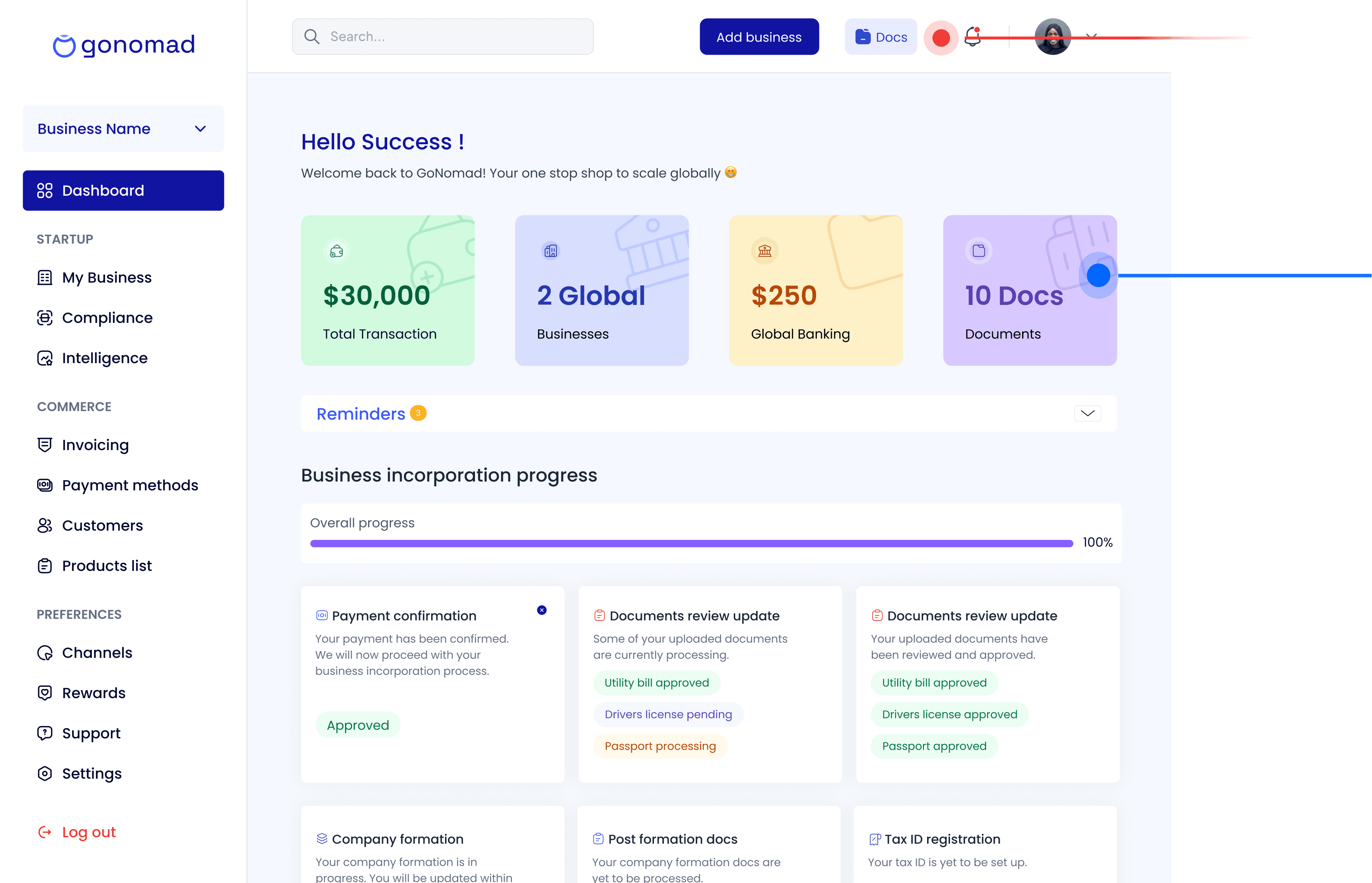
Problem
Problem
Problem
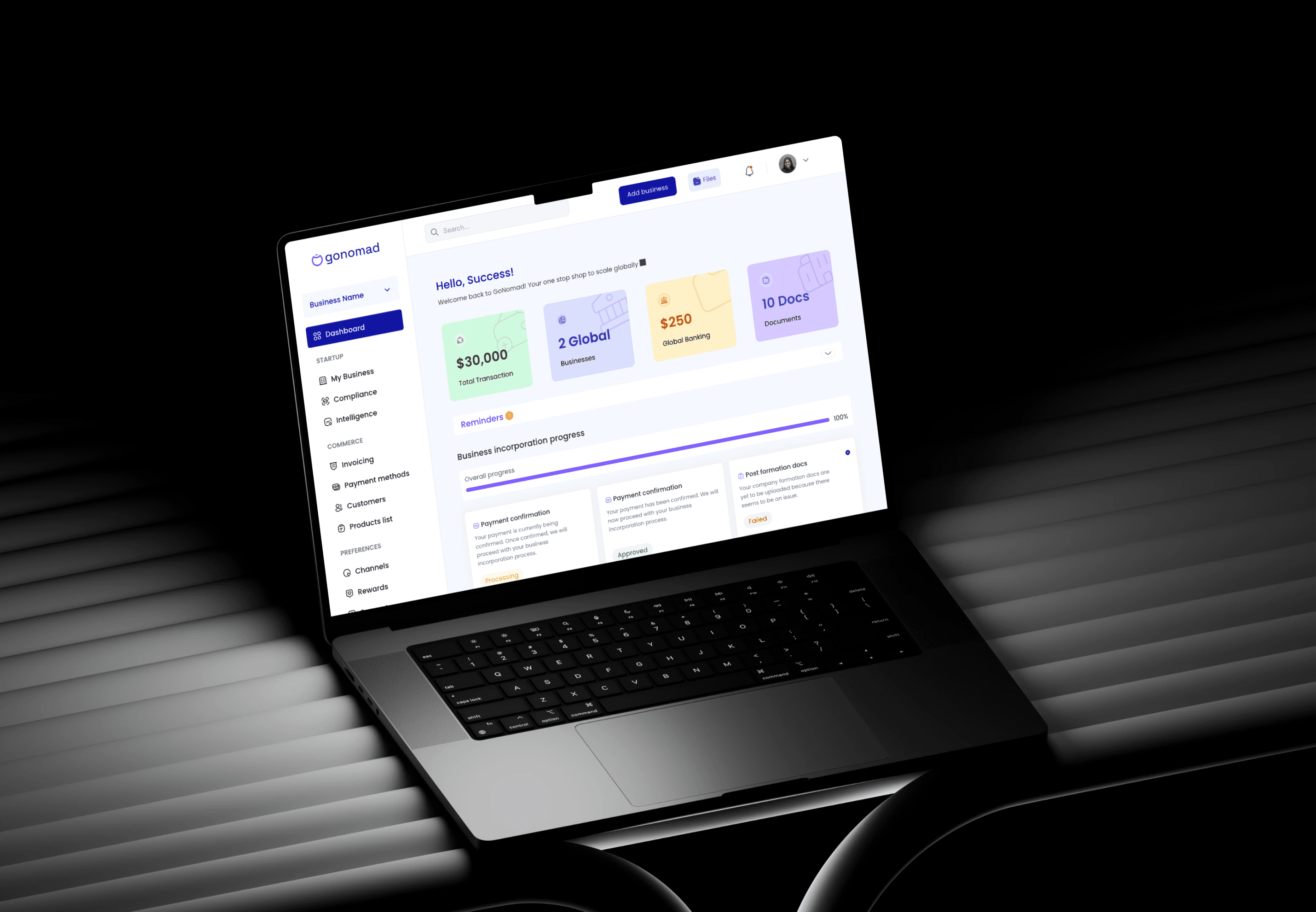
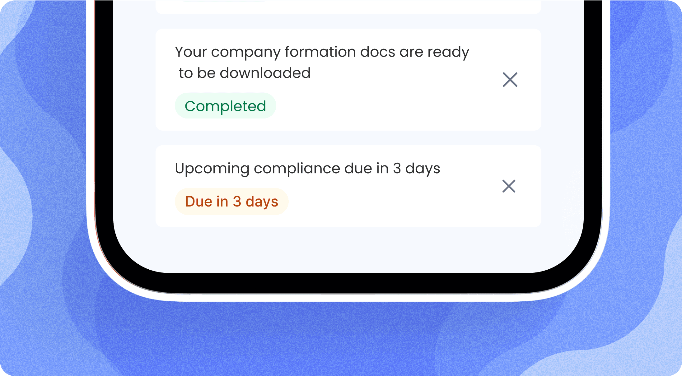
Users didn’t know where they were in the business incorporation process and often had to contact support to confirm their progress. The old dashboard didn’t provide much information regarding that.
Users didn’t know where they were in the business incorporation process and often had to contact support to confirm their progress. The old dashboard didn’t provide much information regarding that.
Solution
Solution
Solution
In order to ensure our users are informed at every step of the incorporation process, I Introduced a visual progress tracker with completion and step statuses like “Pending,” “Approved,” “Processing”), so users can instantly know where they are in the incorporation journey. Also, I included a notification feature that send in-app notifications and also emails regarding their statuses.
In order to ensure our users are informed at every step of the incorporation process, I Introduced a visual progress tracker with completion and step statuses like “Pending,” “Approved,” “Processing”), so users can instantly know where they are in the incorporation journey. Also, I included a notification feature that send in-app notifications and also emails regarding their statuses.
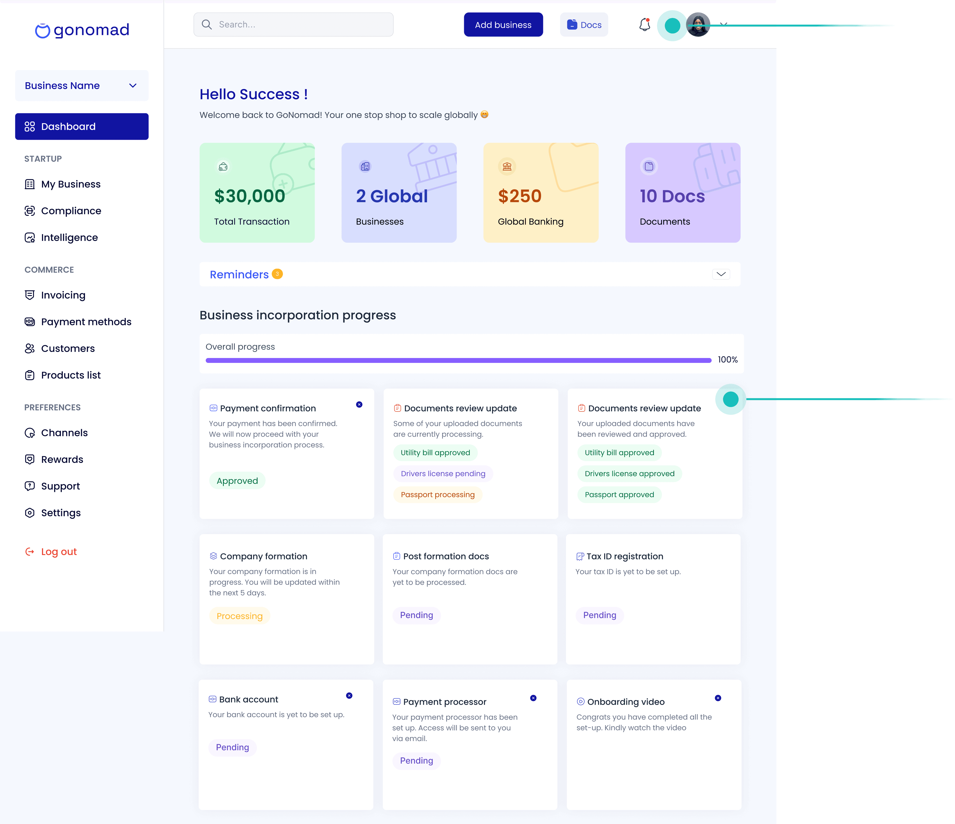
After Redesign
After Redesign
Before Redesign
Before Redesign
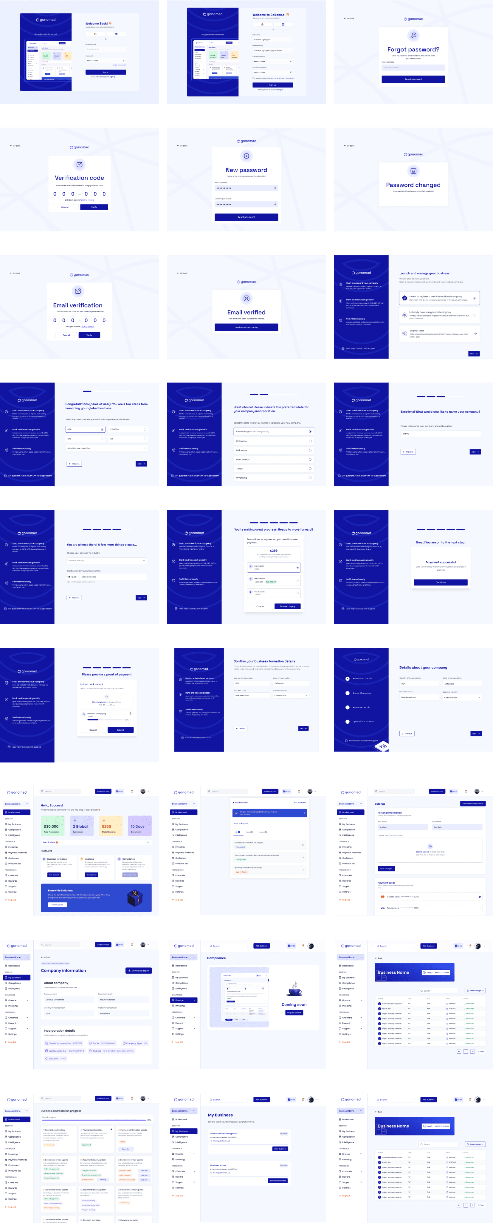
High fidelity screens
High fidelity screens
High fidelity screens
Conclusion
Conclusion
For me personally, GoNomad was a reminder that great UX isn’t just about creativity. it’s about listening, iterating and fixing the small details until they all click into place. Through stakeholder collaboration, support team insights, and focused usability testing, I uncovered the real friction points and solved them in ways that balanced both user needs and business goals.
For me personally, GoNomad was a reminder that great UX isn’t just about creativity. it’s about listening, iterating and fixing the small details until they all click into place. Through stakeholder collaboration, support team insights, and focused usability testing, I uncovered the real friction points and solved them in ways that balanced both user needs and business goals.
Impacts of the redesign on GoNomad
Impacts of the redesign on GoNomad
The redesign of GoNomad didn’t just improve the look and feel, it delivered measurable results:
90% Task Completion Rate: Users now complete the onboarding flow faster with fewer frustrations and reduced reliance on support.
Improved User Retention: The engaging dashboard and real-time notifications encourage users to return after their business incorporation.
Increased Adoption and Conversion: The bank transfer feature made the app more inclusive and this resulted in more users using the product and more paid conversions
Reduced Support Tickets: Clearer flows and better communication significantly cut down inquiries related to incorporation, document access, and payment barriers.
Boost in Revenue: With higher adoption and engagement, the company has also seen a direct positive impact on revenue growth.
Where things are now!
Where things are now!
GoNomad is currently live at Gonomadhq.com and it now feels like the product it was always meant to be: sleek, intuitive, and genuinely helpful. And that, to me, is the real win.. The redesign of GoNomad has fundamentally transformed the user experience for our clients. By solving the problems identified during the research phase, I delivered a product that streamlined the incorporation process and increased user satisfaction.
GoNomad is currently live at Gonomadhq.com and it now feels like the product it was always meant to be: sleek, intuitive, and genuinely helpful. And that, to me, is the real win.. The redesign of GoNomad has fundamentally transformed the user experience for our clients. By solving the problems identified during the research phase, I delivered a product that streamlined the incorporation process and increased user satisfaction.
Thanks for reading up to this point. I know it was long 😄
Thanks for reading up to this point. I know it was long 😄
I am the designer you need to bring
your ideas to life and scale to millions
I am the designer you need to bring
your ideas to life and scale to millions
I am the designer you need to bring your ideas to life and scale to millions
Get in Touch.
Get in Touch.
Get in Touch.
So we can talk more about...
So we can talk more about...
So we can talk more about...
c
2024 Success oghogho All rights reserved
2024 Success oghogho All rights reserved
Made with ❤️ by Success Oghogho
Made with ❤️ by Success Oghogho
c
2024 Success oghogho All rights reserved
Made with ❤️ by Success Oghogho